Working with galleries


Standard member
A question about video display and using the image fader block.
Chip i will install another copy of composr. I can keep it standard and use the video gallery. I should be able to help you better like that.
Standard member
Standard member
Standard member
Standard member
the other thing i forgot about was the Top title, it lays over to the left. If you want it central i did margin left fifty percent and margin right fifty percent. This makes any title central regardless of screen size etc.
Mostly it was just small things i noticed, but better to mention them. If it was a fun site then fair enough, but seeing as its a advert to your business, which is art based…..I figured looks matter.
Now where is our guru to sort out my CSS problem!!! Fancy taking time off on a weekend! What a cheek. Isnt like we didnt let him have Christmas day off is it!
Standard member
Here's some links in the meantime:
Main site: Kiln & Crafts
The gallery containing the video
Again thank you. You've been a big help. Designing a website while being blind isn't the toughest thing I've ever attempted for sure, and I've designed many over the years. However, those around me have no tech skills at all and aren't the best of putting in to words things wrong and need fixing.
Standard member
Now you have a couple of off centre elements, not sure if they are easy to move. I tried briefly in developer without much success, but your skills are way better than mine. So i will describe what i see, you can decide if it matters or not.
Ok front page, if i had to really nit pick and it is really nit picking…..
Right hand side, bottom border under weekly canvass class, is 1 pixel too high! it grabbed my eye, but i am looking for faults. It does impeded very slightly on the words, making them look slightly cramped to the the bottom border. If you can alter it fine, if not then its a long way from being a problem.
The brushes are good and well centred. The word Welcome near the bottom of the brushes could do with lifting so it sits centre of the brushes and not the bottom.
Again I am not sure i would actually alter it myself, but as it stands it leaves one hundred and sixty pixels of white space, from the top of WELCOME, to the bottom of the title border. The space from the bottom of the WELCOME word to the bottom margin of WELCOME to kiln and crafts is only seventy pixels.
So if you imagine the two brushes with Welcome between them, this leaves a blank white area of two hundred and six pixels wide, by one hundred and fifty pixels wide. Or approx the size of the newsletter sign up box.
I have included a screen shot for those around you, it may help them understand what i am trying to explain. it is a negative white space and lifting the SPINNING WELCOME word a little, would negate the white space.
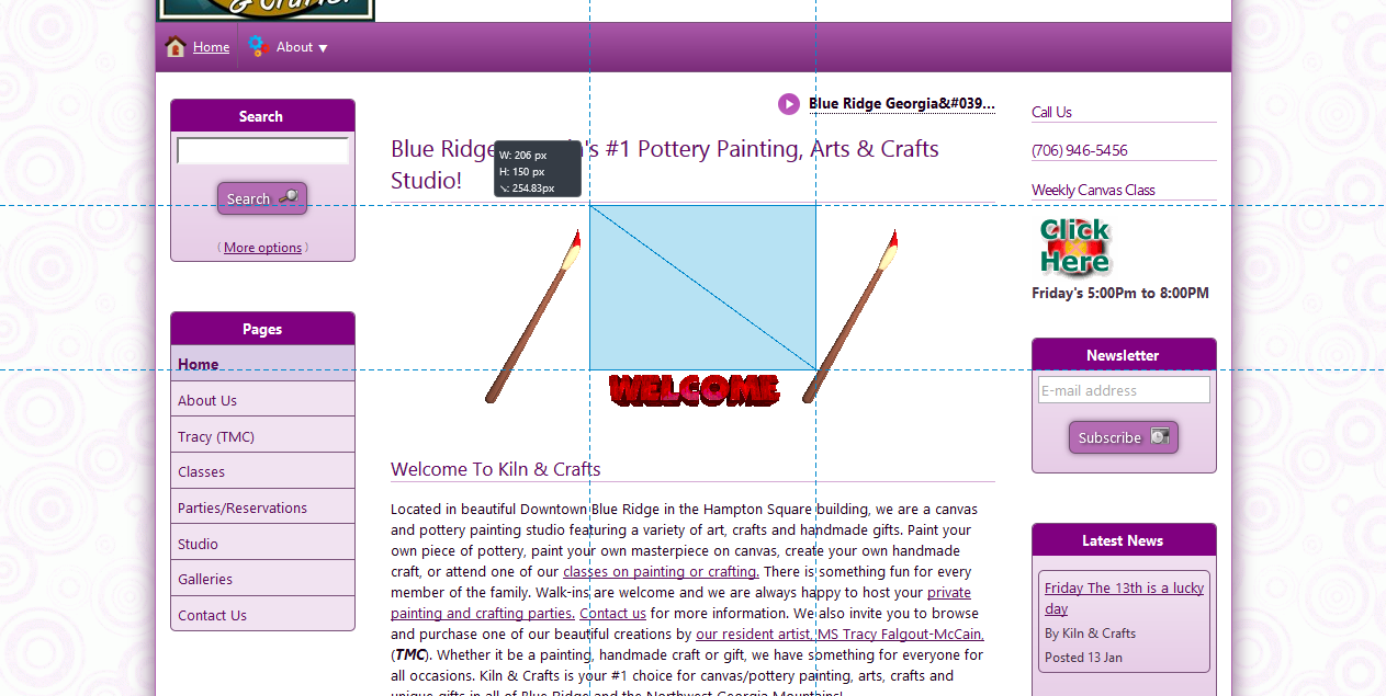
The blue box in the screen shot is for their benefit, you could leave it if its part of the picture and a hassle.
Your other option would fix another problem, this time to do with your 'GET DIRECTIONS ' Box.
Give me an hour or so and i will see if i can Photoshop my suggestion, and post it. I will also describe it to you, that way those around you can see what i mean, and you can visualise it. Between the two, if you want to change it, then they will see when it looks the same as the Photoshop picture.
i am not great with Photoshop, so its an approx pic. I shouldnt be long….
Standard member
image down and hours text up under the heading. Again thank you so much for your feedback. Good stuff and it helps me greatly.Click Here
Standard member
So let me explain what i had in mind, and why my idea wont work.
Your box with, enter starting Address looks misplaced, however it dosnt fit anywhere else and still look good. So i would leave it, the only suggestion i can make with it is, can you make the enter starting address bold text? This would then match your address to the left of it.
Its not major by any means.
The opening times table leaves too much negative white space on the right hand side. But having tried to equal it out, i found with seven days in a week, it just dosnt work. the only thing you could do is instead of two columns have four columns. So duplicate what you have now, with two extra columns, this would give you two days per row, side by side.
The last row would of course have two columns empty where day eight would be. The only plus side to doing this, is the table with the columns kept the same width as now, would fill the space the centre body entirely, making it look neat and getting rid of a large blank white area.
To try and describe it better, the table would read like this.
Top Row column one WEEK DAY, Top row Col two HOURS, Top Row Col three WEEK DAY, Top row Col four HOURS
Second row first column Monday, second row second column CLOSED, Second Row third Column Tuesday, second row fourth Column closed.
By the way you have spelt Wednesday wrong. You have W E N D E S D A Y. Instead of W E D N E S D A Y.
Third Row First column WEDNESDAY, Third Row second column open sign and times, Third row third column Thursday,
Third row fourth column, open sign and times.
Fourth Row first column Friday, fourth row second column open sign and times. Fourth Row third column Saturday.
Fourth row fourth column open sign and times.
Fifth row first column Sunday, fifth row second column open sign and times. Fifth row third column grey out.
Fifth row fourth column grey out.
That should equal the use of space and make it look neater. I M H O.
The video page.
The video box is not central between the left and right box columns, the left margin from the edge of the left box, to the edge of the black video box is 32 pixels. The right hand edge of the black video box, to the right hand edge, of the right hand side box's is one hundred and four pixels.
Now you could leave this, but if you do leave it, i suggest you make the details box, below the video player central.
At the moment the details box is too far right, you have thirty four pixels from the right hand side, of the details box to the right hand column of box's, and two hundred and fifty four pixels from the left hand side of the box, to the left hand hand column of box's.
If you leave the video player as it is, you can make things look more even by alter your code in dot right space dot box.
CSS code. the following will make the box central to the player, but not to the page.
At the moment dot right (space) dot box reads margin zero pixels, add to that code, margin-right: 11em;
If you are changing the player position to equal it, then you will need to alter the 11em margin to 7.8em (on my screen anyway).
Finally the caption above " more from this gallery", really should be done as a heading font and made central. At the moment its a paragraph font and aligned left hand side of the box. Or maybe leave the size and just make the text bold.
I hope that helps you a little.
I am always happy to help
LG
Standard member
Standard member

Standard member
Speaking of the directions box it may be something I want to think about. I've bolded the text for the moment to match the address. Once you click on the Get Directions button it opens in another window. I might want to think about moving that form to one of the side panels. I'll have to give that some thought. I did shorten the address by one line by including our suite number on the street line, which is considered here in the US to be acceptible. I may take out the phone number since I have it over on the right side panel. Something again to think about.
Thanks so much for all the feedback. Again it has helped tremendously.
Standard member
One thing i did notice, you have caught the keyboard and put a left hand square bracket in. Its one the About Kiln and Crafts page.
Under the last paragraph that reads gifts as well as offerings of unique handcrafted items from selected artisans.
you have one or two blank lines then a stray square bracket. You will need to delete this.
I am the worse for typo's! When i did my first PhD, we were always advised to get four people to proof read, our thesis. I discovered i was dyslexic, so now i try and make sure i always get my final drafts proof read.
for some reason when its your your own work, you read what your head tells you was meant to be there. You rarely read what is actually written.I imagine a screen reader is a bit like a sat nav, the voice isnt human enough to pick up subtle mistakes.
I am learning alot helping you anyway, so its not a problem. It has also made our project group rethink our site. I dont teach any kids with sight problems, but i would like our site to be more inclusive.
Due to the subject matter, our site will be heavily graphic based, but i think i can tweak the courses, if i go through them carefully and make them read better.
So it is extremely useful working with you.
LG
Standard member
It does get a bit old having to listen to everything for sure. I do have a refreshable Braille display but just haven't got
around to setting it up here at the shop. By default most screen readers set up with most punctuation and math/misc characters turned off. Otherwise it gets a bit crowded. Imagine the following:
There <space> was <space> a <space> time <comma> <space> back <space> long <space> ago <comma> <space> when (blaa blaa blaa.
you can kinda get the picture. then add in . / ! @ # [ and all the others and you can probably see why most users have these symbols for the most part turned off. Years ago, back in a far distant land, when I was in college and studying computer science I had to turn everything on. May be the reason I quit programming all together about 20 years ago and stuck to playing music for a living.
Standard member
I spell dot instead of just putting a period, that way i figure less mistakes are made. I also try and write differently when replying to you.
It takes some practice though to alter your style of writing, i am not great at explaining in writing. So this is a good opportunity to improve my skills of description. it matters alot when you teach a couple of days a week like i do.
The above with space written etc sounds alot like my ex wife! and yes it does drive you mad. so much so i went as far as splashing out on a divorce to cure it.
Standard member
Looking in developer i can see exactly why you have placed it as you have, the distance in pixels is equal according to padding and borders.
But it isnt visually equal.
You need to drop the graphics by about fifteen pixels, i know the padding and borders might make that sound stupid, but visually it will make the graphic central, which is what i think you were aiming at.
Its a picky thing again, but i am aware you want the site polished.
Having said that, i will also check the site on the laptop later. the laptop has a wide screen, so sometimes makes a site look totally different.
Standard member
lg11 said
I slowly figured out how a reader might work, thats why i try and write in short blocks. When the punctuation matters like the CSS selector in one post.
I spell dot instead of just putting a period, that way i figure less mistakes are made. I also try and write differently when replying to you.
It takes some practice though to alter your style of writing, i am not great at explaining in writing. So this is a good opportunity to improve my skills of description. it matters alot when you teach a couple of days a week like i do.
The above with space written etc sounds alot like my ex wife! and yes it does drive you mad. so much so i went as far as splashing out on a divorce to cure it.
From “Post #1,691”, 16th January 2017, 4:11 pm
You've done a fantastic job of explaining thus far. There's been a time or two I've had to read over something a couple of times, but that's not your manner of explination, but my ability to understand what you're trying to tell me.
The bit about the x-wife is funny, I don't care who you are… that's good stuff. I play music for a living and was doing a show a few years ago. While talking to one of the customers he explianed that he'd lost 120lbs the previous year and all in the span of about 2-1/2 months. I asked him how he acomplished such an amazing feat and he replied,
I divorced her!
Standard member
lg11 said
Chip, one thing i have noticed is the welcome graphics. The one with the pallet pics and welcome word.
Looking in developer i can see exactly why you have placed it as you have, the distance in pixels is equal according to padding and borders.
But it isnt visually equal.
You need to drop the graphics by about fifteen pixels, i know the padding and borders might make that sound stupid, but visually it will make the graphic central, which is what i think you were aiming at.
Its a picky thing again, but i am aware you want the site polished.
Having said that, i will also check the site on the laptop later. the laptop has a wide screen, so sometimes makes a site look totally different.
From “Post #1,693”, 16th January 2017, 5:05 pm
I'm not sure exactly what you're saying. Drop which graphics? the entire placement of the brush and welcome sign? or just the brushes or just the sign? I'm doing everything in comcode, so I'll have to think about how to go about doing that. I'll probably have to use the simihtml tag to acomplish that. Thanks again for all the feedback. Yes I'm wanting it to be polished.
You know, my wife and I have been together since we were 11 years old. We married at 16, which was 41 years ago. She has stood beside me all these years while I traveled on the road making music. Now the kids are grown and out of the house and this shop is my way of standing beside her while she lives out her dream for a change. She's a remarkable artist, but has absolutely no interest in web designing. That's the reason it is so important to me to make the site the best it can be for her.
Standard member
The file will be global dot CSS.
Standard member
Dont worry it will look the business when its finished.
1 guest and 0 members have just viewed this.