Important: This website is now read only (except to admins) to comply with the UK Online Safety Act. Composr CMS is in the process of migrating to a new Constitutional governance model and Bazaar development model, with functionality of the old website (constructed by ocProducts Ltd, the prior copyright holder, a UK company) spread between GitLab and the new website (which has no connections to the UK).
I have been doing a lot of work on the theme on my site, there is still a bit of work to go yet, but once I have finished I will be uploading it to the themes area here. I am hoping to have it finished in about a week.
In the meantime I am looking for feedback and any suggestions on making it better. Website link in signature.
Absolutely agree with the header logo. I am currently working on a new page background, so it's not so plain and a logo which best reflects what we are about.
I have learnt a lot about composr and how the themes are SUPPOSED to be modified. I have made a lot of errors in the making of my sites theme, while it appears fine and functional, the changes I have made are not user friendly and not global. This is something that I learnt after making a LOT of changes.
With that being said I will be making another theme, very similar to the one I use and making it available. This time I will be using the correct image calls and commented theme and css files. I will also make it known that I only do fixed width themes (Generally around 1250px), that way I can be sure it will all look and work as intended. And I don't do black themes, maybe a dark navy blue though.
Once I have a couple of themes in the downloads area, there are a couple of blocks, and if I learn some more maybe a couple of addons I would like to make and contribute.
Really nice theme Paul, I would use it for sure. Not sure exactly what you learnt on your journey but if it is Tutorial worthy I would be interested to learn what you know
Really nice theme Paul, I would use it for sure. Not sure exactly what you learnt on your journey but if it is Tutorial worthy I would be interested to learn what you know
It's all in the tutorials. But the biggest thing for me was the editing of the $THEME_WIZARD_COLOR at the start of the global css, instead of individual css edits. Deal the with $THEME_WIZARD_COLOR first, then fine tune with other edits. I am happy to give you the theme I am using on my site as is, do note that you will need to do a lot of tweaking.
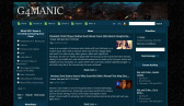
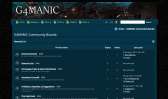
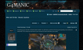
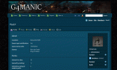
In the meantime the link below is a theme I am working on to share with the community, hopefully doing it right this time. I went for a darkish theme first, so there was a least one available for download.
So far, the theme as per link above has taken 30 mins to do. And nearly ready to release. I will create a new post on how to have the news displayed as is on my site per footer link. That requires editing the theme file and a couple of css files. As it may not be the way people want their news displayed I didn't include it in the theme itself, but rather separate.
.0Ok. I will upload the theme here, and if one of the admins here is happy with the theme then please do feel free to add this to the downloads area. If anyone sees any issues with it please let me know and I will fix them and upload a new version.
I will call this one G4-Midnight
https://www.g4manic.com/pg/start?keep_theme=G4-Midnight
Made an incorrect call to a couple of images, fixed and new version attached. V1.03 Attachment
Two things I've noticed with the dark theme, the text on the login screen is still black and the timezone dropdown on profiles isn't showing text. It's nice though
Two things I've noticed with the dark theme, the text on the login screen is still black and the timezone dropdown on profiles isn't showing text. It's nice though
.0Ok. I will upload the theme here, and if one of the admins here is happy with the theme then please do feel free to add this to the downloads area. If anyone sees any issues with it please let me know and I will fix them and upload a new version.
I will call this one G4-Midnight
https://www.g4manic.com/pg/start?keep_theme=G4-Midnight
Made an incorrect call to a couple of images, fixed and new version attached. V1.02 Attachment
Try a few different browsers and fiddling with the text size setting in the browser. Maybe could be a font size issue too, if system doesn't have the font it may choose one with another size, with different em sizing.
If not, please let us know how we can do better (please try and propose any bigger ideas in such a way that they are fundable and scalable).
If so, please let others know about Composr whenever you see the opportunity or support me on Patreon.
If my reply is too Vulcan or expressed too much in business-strategy terms, and not particularly personal, I apologise. As a company & project maintainer, time is very limited to me, so usually when I write a reply I try and make it generic advice to all readers. I'm also naturally a joined-up thinker, so I always express my thoughts in combined business and technical terms. I recognise not everyone likes that, don't let my Vulcan-thinking stop you enjoying Composr on fun personal projects.
If my response can inspire a community tutorial, that's a great way of giving back to the project as a user.
I couldn't reproduce in the time I took, but I think I found the cause and could have with a bit more work.
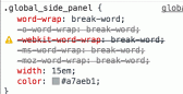
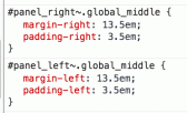
Panels have 15em width (default is 13em): Margins around the middle are 13.5 em: So the middle section is overlapping with the panels, and something about Rajesh's test content means that the allocated space is being required, jutting off the panel to find the space above the middle area.
The padding you have makes it visually look okay on your site (and mine), but presumably because the content on your site isn't needing the space as 'hard' it isn't doing that jutting.
I'm sure there's a better explanation than I gave, but basically that's the cause, overlapping.
You can also see it using Google Chrome's inspect tool on the middle area, you can see it visually overlapping because Chrome will highlight the space.
Try increase margin-left/right to 15.5em and reducing the padding-left/right to 1.5em to compensate.
If not, please let us know how we can do better (please try and propose any bigger ideas in such a way that they are fundable and scalable).
If so, please let others know about Composr whenever you see the opportunity or support me on Patreon.
If my reply is too Vulcan or expressed too much in business-strategy terms, and not particularly personal, I apologise. As a company & project maintainer, time is very limited to me, so usually when I write a reply I try and make it generic advice to all readers. I'm also naturally a joined-up thinker, so I always express my thoughts in combined business and technical terms. I recognise not everyone likes that, don't let my Vulcan-thinking stop you enjoying Composr on fun personal projects.
If my response can inspire a community tutorial, that's a great way of giving back to the project as a user.
Appreciate you looking into this. I will be installing a local server on my computer so I can see how the themes look with a default install, and hopefully avoid these issues in the new themes.


 Last edit: by Paul Flavel